When a user first signs up to a new application, it can sometimes be a confusing experience, especially if the application has many features. Even with a carefully crafted intuitive interface, it’s important to guide the user through the product and ensure they are carefully helped onto the platform.
This guidance process is referred to as onboarding and provides two main goals:
- Confront the user’s initial confusion when using the product
- Ensure the user becomes quickly invested in the product
The first goal is highly important – confusion at any stage when using a product will generate negative emotions and tarnish the user’s experience with the product. The resulting association between negative feelings and the product will often drive users away. Confusion also leads to frustration which will impact the users perception of the products usability – even complex products which evoke positive emotions can be perceived as being much easier to use than they actually are.
The second goal is important for ensuring user retention; with many alternative products on the market – users often have the choice of quickly moving to another service if the current one proves to be too complicated or confusing. This can be overcome by quickly submerging the user in the product; getting them started as quickly as possible and allowing them to start creating their data within the application. The more time invested in the service, the less likely the user is to leave.
The Blank Slate
The blank slate refers to the natural state of an application before any content has been added, while promotional websites usually show a product in its full glory – packed with content, this is never the first thing the user will see after signing up. It’s important therefore not to leave the user feeling neglected in this void, the blank slate is the perfect canvas for providing hints and tips on how to get started with the product.
Examples
There is no standardised method of onboarding – each application will require its own solution, however there are some tried and tested methods which can be applied. Broadly speaking, there is no right or wrong way to do it – the only wrong choice would be to completely omit the process altogether; any user guidance is better than none. The following examples show some popular techniques.
Tumblr
Tumblr provides one of the most straight forward onboarding processes; firstly – the initial sign up process is simple and provides a low barrier to entry – there are no excessive input fields or activation emails required, allowing the user to delve straight into the application within seconds.

Upon entering the application, the user completes a simple, three step process in order to maximise their initial experience by providing relevant content in relation to their interests. This first screen allows them to select categories of personal interest.
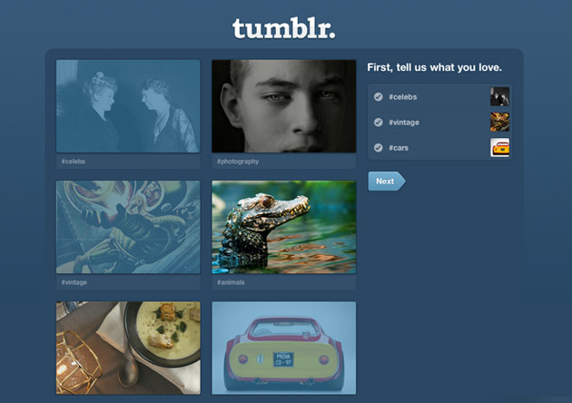
The subsequent screen then demonstrates the results of the previous choice – in only a matter of seconds the user’s account has been populated with content, providing the opportunity to begin investing time in the application through content consumption.

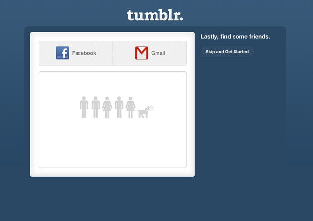
The final step in the process encourages the user to connect with their friends – this further increases engagement and the user’s investment in the product – it’s much more difficult to leave an application that contains personal connections and contacts.
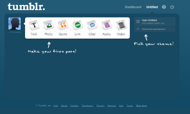
Finally, now armed with a network of friends and content – the user enters the main dashboard application; there are some further getting started pointers here; sign posts direct the user on how to make their first post or how to choose a theme for their blog. These signposts are helpful, and most importantly – non intrusive, the user doesn’t have to navigate through modal windows or dialogs in order to get rid of the onboarding messages.
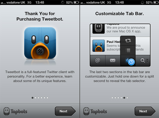
Tweetbot
Another common approach to onboarding is to use a short video demonstration of the product, this is usually included in the pre sign up stage. The video on the Tweetbot homepage guides users through basic tasks such as composing a tweet, refreshing the timeline and using lists.
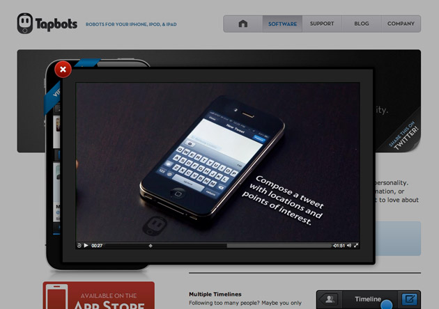
The advantage of this approach is the video also acts as a marketing tool and can influence users to sign up, the down side however; is the onboarding process is less engaging and doesn’t provide the user with any real interaction with the product. Even a two minute video can be a lot to take in, users may still end up confused when they actually begin using the application for the first time. The Tumblr approach is much more effective because it provides the user with the opportunity to engage with the product directly; people learn by doing, not listening to instructions.
In addition to the video, the Tweetbot for iPhone application also provides an introduction to the application the first time it is opened, this is useful but it still fails to fully engage the user in any direct interaction with the application.
Computer Games
Modern computer games almost certainly employ the most effective onboarding techniques. These are always intuitive and most importantly, immersive. Many games have complicated controls and procedures - expecting a first time user to read a manual and attempt to remember control sequences and combinations would severely tarnish the user’s initial experience with the game.
To combat this complexity, many computer games offer an initial training level, in which the user is guided through the completion of various tasks in order to equip them with the knowledge to operate the controls. This training level integrates with the game story so the onboarding process gels seamlessly with the game play. For example; in many first person shooter games, the first onboarding level provides the user with target practice in which they learn the controls for handling and operating a gun – these levels are simple and provide no pressure in the form of time constraints or having to battle with enemies.
In addition; various hints are usually provided throughout game play – such as which buttons to press during a certain situation, e.g. “Press X to switch to grenades”.
There are many influences from computer games that app designers can draw from, most importantly – creating an interactive, immersive onboarding process that allows the user to gain real experience by interacting directly with the product.
Vizuali Case Study
When building the first version of my scrapbooking application; Vizuali – I learnt the hard way the cost of failing to integrate a successful onboarding process, in fact I completely omitted this feature altogether due to a lack of understanding and awareness. After receiving an influx of new users, I quickly began to notice that many lost interest moments after signing up and never to return.
Thankfully, due to some feedback from a few very helpful beta testers, it became clear that people were unsure of how to use the application when faced with it for the first time, after all I was experimenting with some new techniques such as bookmarklets – which many people are unfamiliar with. During the initial product design, I foolishly expected that people would immediately know how to install and use a bookmarklet – which was a costly mistake.
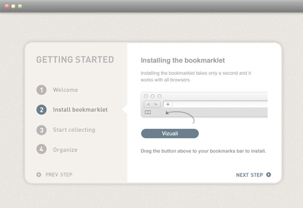
This feedback prompted me to reconsider the blank slate presented to users after signing up and the next design iteration featured a short, introductory slideshow sequence explaining in four steps:
- How the application works
- How to install the bookmarklet
- How to use the bookmarklet
- How to organise items within the main application
The slideshow also utilised animations to help inform the user, for example – dragging the bookmarklet button to the browser bookmarks bar was represented by a simple animation showing the movement required. This immediately helped to solve the problem and feedback from users was becoming a lot more positive, although there was still room for improvement; the process didn’t engage users directly in interacting with the application.
The second iteration applied a much more immersive approach, the first screen provides the user with the bookmarklet button and instructions on how to get started. The ‘drag me’ text informs the user that the button should be dragged to the bookmarks bar, whenever the user begins to drag the button a large arrow appears pointing to the browser bookmark bar where the button needs to be placed. This allows the user to learn by actually carrying out the task of installing the bookmarklet and no information has to be remembered.
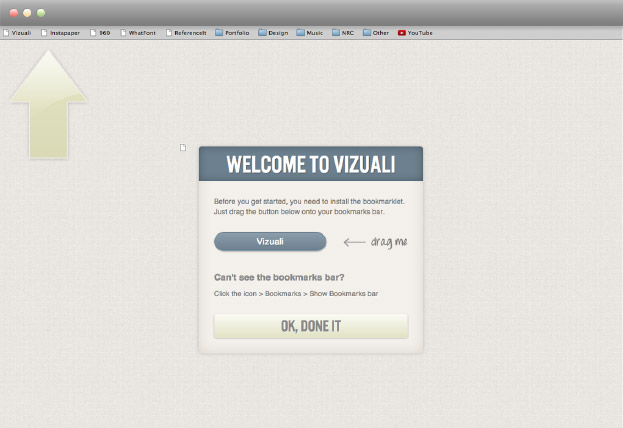
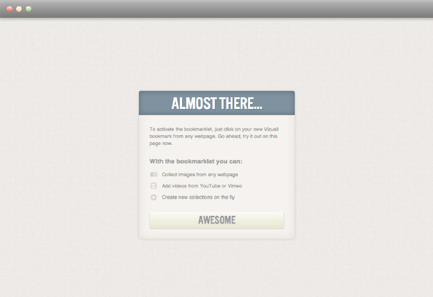
This modal window does provide a barrier to entry to the main application but for a valid reason; the entire functionality of the software relies on the installation of this bookmarklet. Once the user has completed this task they are presented with another small splash screen providing some additional information on how to activate the bookmarklet and what it can be used for.
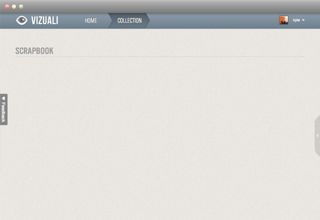
After closing this dialog the user moves immediately into the main application; in the original design they would have been presented with a blank slate at this point, however this has been revised to provide the user with a sample collection. This allows them to see how the application looks with real content in place and also provides cues on how the application will operate and function, this screen has also been supplemented with a tooltip to help further inform the user. Once a tooltip has been closed, it is assumed the user is now familiar with this action and it will not be presented again.
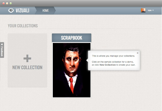
The user can at this point; choose to create their own collection, delete the sample collection or click on the sample collection to view further content – clicking on the sample brings them to the following screen, which provides further visual cues on how the application will look and operate when populated with content.
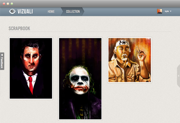
Comparing this to the original design, where the user was presented with the blank state – it’s obvious why this was confusing; there are no visual cues on how the application works, in contrast the sample content allows the user to begin engaging with the application and using real functionality.
Conclusion
To sum up; no matter how simple or intuitive your application may seem – it’s always a good design choice to implement some onboarding features, remember – just because it makes sense to you, doesn’t mean it will to everyone else; users are viewing the product from a completely different perspective and often will not possess the same skills and knowledge as the product designers or developers.
The key characteristics of a successful onboarding process therefore are:
- Interaction – allowing the user to engage with the product directly
- Speed – ensuring the user can begin using the product as quickly as possible
- Unobtrusive - creating no barriers to entry and only appearing during an applications first use