Dark Patterns – The Art of Online Deception
In a new series of articles exploring the psychology of persuasion online, I will be investigating some of the design techniques that can be employed to persuade a user’s decisions online, including - social validation and scarcity
This first article in the series explores the most extreme form of user persuasion; dark patterns. I use the term persuasion very loosely in this context; deception would be more appropriate. This is not intended to be a how to guide to deceiving users, the purpose is to create awareness about these controversial design patterns and how you can avoid falling into these traps.
What Are Dark Patterns?
A dark pattern is a user interface design technique used specifically to trick and deceive users, they are commonly found on eCommerce websites – popular examples include hidden charges on airline websites and items being discreetly placed in your shopping cart on shopping stores.
The basic principle is to make it easy for the user to accept something unwanted, and then very difficult to undo it. Within other technology circles, such as SEO and hacking, the terms black hat and white hat are used to describe people who perform tasks for malicious and non-malicious purposes respectively.
Within the field of UI design, this metaphor can also be applied; the white hat designers are those creating honest interfaces with the intention of providing the most optimal experience for the user, while black hat designers are those applying dark patterns. A grey area also exists between persuasion and deception as many techniques can be used to encourage users, such as recommendations and social validation, but don’t necessarily trick the user into a specific action – I’ll be covering these topics in more detail in separate articles.
Why Use Dark Patterns?
Deception is common human behaviour, people regularly trick or lie to each other – sometimes for entertainment, but most often for personal gain. In the case of dark patterns, in all cases, they are used to increase conversion rates and profit. There are huge ethical concerns surrounding the use of these patterns and they are not just specific to the web, trickery and psychological manipulation are present in all forms of commerce, both online and offline.
Let's look at some examples.
1. The Roach Motel
The Roach Motel pattern is one of the most common and forms the basis of the dark pattern ethos – easy in, difficult out. It is named after a cockroach trap constructed using a cardboard box and sticky paper – the cockroaches check in, but they never leave.
A popular example of this is email subscriptions; it’s incredibly easy to find yourself subscribing to an email newsletter when signing up for a new product or service – usually this process is simply a matter of clicking on a checkbox.

The process of unsubscribing is usually not so simple; it may unfold like this:
- Click the small unsubscribe link at the bottom of the email
- Log in using your email address and password
- Enter a CAPTCHA
This requires a degree of brain power to recall the password and also to decipher the CAPTCHA, making it awkward to unsubscribe, and what if you’ve forgotten your password? This is very common, seeing as you may not regularly log into the service, the process may now appear like this:
- Click the small unsubscribe link at the bottom of the email
- Log in using your email address and password
- You’re informed of your incorrect password entry
- Retry password
- Password fails again
- Click the ‘forgotten password’ link
- Sign into your email account to retrieve the reset password link
- Reset your password
- Return to the unsubscribe webpage
- Enter new password and CAPTCHA
Evidently, the process of unsubscribing is designed to be much more difficult than the sign up process, in the hope that users will become frustrated and give up.
2. The Lovefilm Breakup
Lovefilm really raise the bar with their cancellation process; I recently tried to cancel my account, which required an awkward phone call to the company.
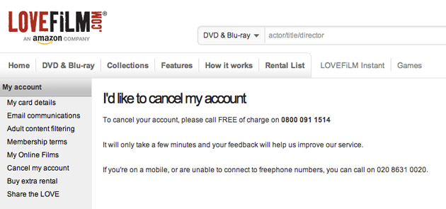
This was a huge barrier to the action I wanted to perform. I now had to tell someone in person that I wanted to leave this service – the phone call lasted for 5 minutes; it was as awkward as breaking up with a long term girlfriend.
I was quizzed on my experience of the service and why I wanted to leave. I explained that I had moved to another provider; which prompted the customer service representative to deliver a grovelling sales pitch on why Lovefilm was better than the rival service, at this point I began to feel guilty for leaving.
I didn’t actually cancel my account at this point – having signed up for the purpose of this article (I didn’t inform them of this) and paid the monthly subscription, the representative convinced me I should cancel at the end of the month instead so I can avail myself of the service and get value for my money. Obviously they’re hoping I’ll either forget or change my mind, but I’m now going to have to go through this same awkward process again next month.
3. Deceptive Copywriting
In order to manipulate through the use of deceptive copywriting, we must understand how users read pages on the web.
When we’re creating sites, we act as though people are going to pore over each page, reading our finely crafted text, figuring out how we’ve organised things, and weighing their options before deciding which link to click.
What they actually do most of the time (if we’re lucky) is glance at each new page, scan some of the text and click on the first link that catches their interest or vaguely resembles the thing they are looking for.
Steve Krug (Don’t Make Me Think, Second Edition)
This is common knowledge to designers, and we use certain design techniques to aid users in this scanning process; visual hierarchy allows large portions of information to be broken into sections and labelled with headings – allowing the user to quickly scan for the section they are looking for. Scale can also be used to make important or common actions, such as call to action buttons, stand out.
These techniques can easily be reversed in order to deceive users; instead of placing important information in headings, it can be hidden in body copy (often amongst rambling or confusing text) or in barely legible footnotes or ‘small print’ as it is commonly known.

When signing up for Netflix, they use a strong visual hierarchy to inform me that I will not be charged until after my free month ends; which sounds reasonable. The small print at the bottom of the page goes on to explain that if I don’t cancel my membership before my free trial ends, I will be charged a monthly subscription (more on this in the next section).
Double Negatives
Another dirty copywriting trick is the use of double negatives, which aims to confuse users.
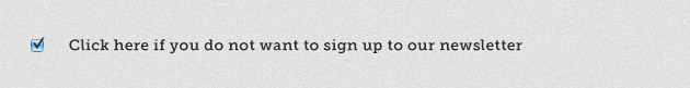
A checkbox represents a positive action, by clicking one – you are agreeing yes to an action; by applying a double negative the natural action of the checkbox is reversed, tricking users into agreeing to something they don’t want.
4. Forced Continuity
Popular with products that offer an initial free trial; credit card details are gathered at the sign up stage in order to begin the trial. In some cases, the reason for this may be legitimate (or seemingly legitimate) – such as Lovefilm who require it as an insurance policy for sending out films on DVD.
The real reason however, is so the company can automatically begin charging a recurring fee once the trial has ended.
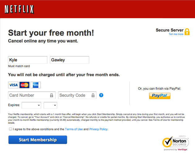
Although Netflix state this in their small print during the signup process, it’s not enough – there is no notification communication at the end of the trial to inform the user that the recurring payment is about to begin – many users may have decided against using the service and forgotten about the trial – it may then take some time before they notice the recurring direct debits from their bank account.
It’s also common practice to hide the cancellation links as discreetly as possible; these will certainly never receive the same attention to detail as the sign up button. On a positive note, Netflix’s cancellation process is much simpler than Lovefilm.
5. Hidden Costs
Hidden costs are certainly not a new trend, neither are they exclusive to the web – they present the user with an initial cost for a product or service to entice them, then once the user has made an action based on this, such as adding the item to their shopping cart – it’s revealed that the product actually costs a lot more than expected.
This technique is popular with airline companies; when booking a flight with Ryanair – it’s initially listed as £38.24 but upon entering into the booking process the actual price is £54.99 due to some additional costs that are not made clear at the start of the process.
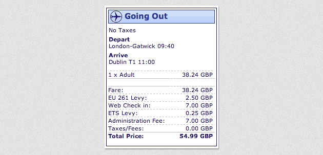
- EU 261 Levy – £2.50
- Web Check in – £7.00
- ETS Levy – £0.25
- Administration Fee: £7.00
That’s an additional £16.75, a price increase of 44%. As the process of acquiring and comparing actual prices for airlines is rather a lengthy one, many users will end up frustrated and go along with the booking they have already started.
Vat Excluded
It’s becoming increasingly more common to list prices excluding VAT online; Studica, for example, list this speaker for £108.95.
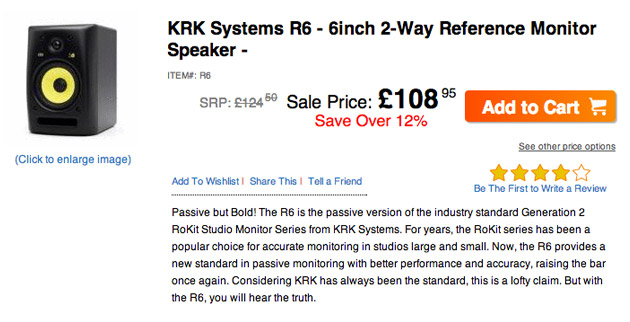
Now, any savvy shopper who’s been comparing prices might be aware that this is far too low for this particular speaker, but this is challenged with some encouraging copy – “Sale Price – Save over 12%” – this might actually make the user believe that this is a genuinely low price for this product. There is no mention of VAT at this point.
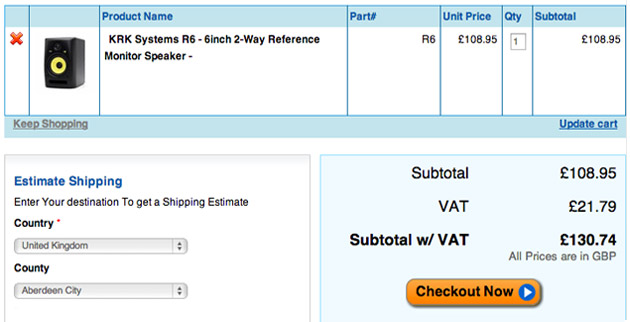
Upon preceding to the checkout, it becomes clear that the speaker is actually £130.74 with VAT included, the user has already invested some time into the process at this stage, the extra £21.79 may not be enough to discourage them at this point.
6. Sneaky Shopping Basket
This involves placing items into your shopping basket without permission, under the guise of a ‘recommendation’. It’s the equivalent of your local supermarket manager slipping a bottle of wine into your trolley because he thinks it will go well with the beef joint you’re buying. In the real world, this would be completely unacceptable – however, not online.
Amazon frequently recommends products that will go with what you are buying, this is not to be confused with a the sneaky shopping basket pattern.
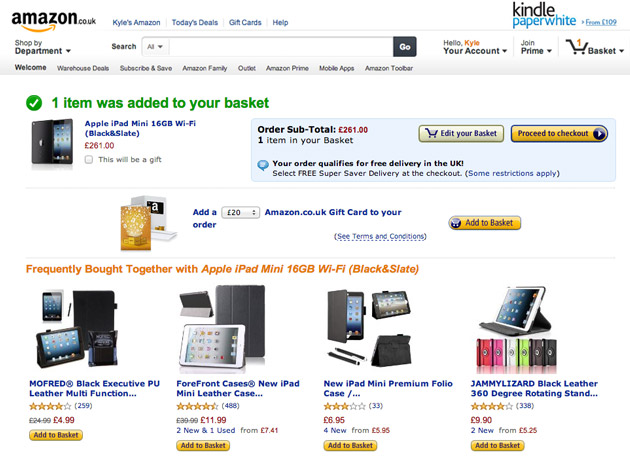
Amazon is merely recommending additional products you might be interested in – it’s up to you to place them into your shopping cart. Let’s take another look at the Ryanair booking process in comparison.
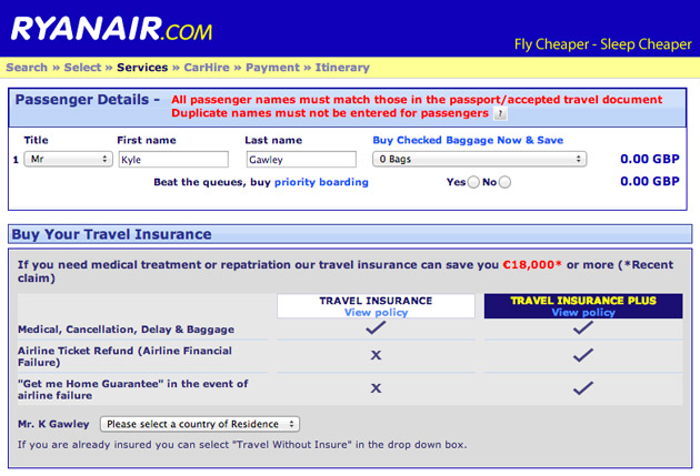
As you can see, Ryanair have went to the trouble of including some travel insurance in my booking, at no point in the booking process did I request travel insurance. The process of opting out is even more obscure, I must click on a drop down menu labelled ‘country of residence’ and select the ‘Travel without Insurance’ option.
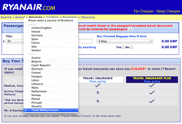
This may seem like shoddy design but it’s intentionally done to confuse users; many people will assume that country of residence is a legitimate field required in order to make a booking. Users would never assume that the option to opt out of travel insurance would be buried within a drop down menu containing a list of countries – the two things are completely unrelated.
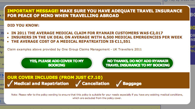
After opting out and proceeding, my booking process is immediately interrupted with an ‘important message’. This is another type of dark pattern, called the Road Block. I’m now being subject to fear tactics to encourage me to reconsider my decision not to purchase travel insurance. This is highly aggressive and at this point, many users will begin to question their original decision.
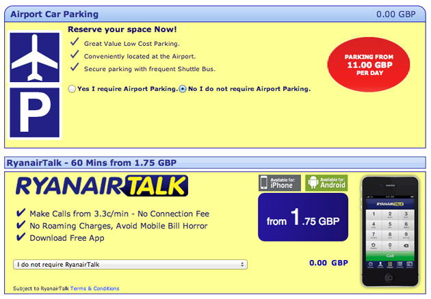
The next screen then tempts me with various other items that could increase my travel cost; these are not automatically included in my booking but I do have to individually select that I do not require each of them.
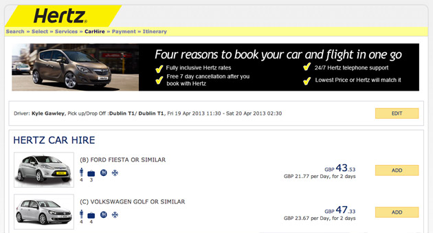
Now I’m confused, I’ve been re-directed to a completely different website, offering me car rental services; it’s deliberately confusing and while it’s not using the sneaky shopping basket pattern, the whole recommendation process is intense and constantly requires me to refuse additional products – which is playing on the psychological discomfort people experience when saying no.
7. Default Settings
Many users will stick to the default values and settings within a user interface; this trait can be utilised to help the user:
Defaults make two essential contributions to usability:
By showing a representative value, they serve as just-in-time instructions to help users understand how to complete a field.
By showing a frequent value, they help users understand the commonly expected response, as opposed to more atypical ones.
Jacob Nielsen (The Power of Defaults: http://www.nngroup.com/articles/the-power-of-defaults/)
Or, users can be manipulated by ensuring that unwanted options are selected by default.
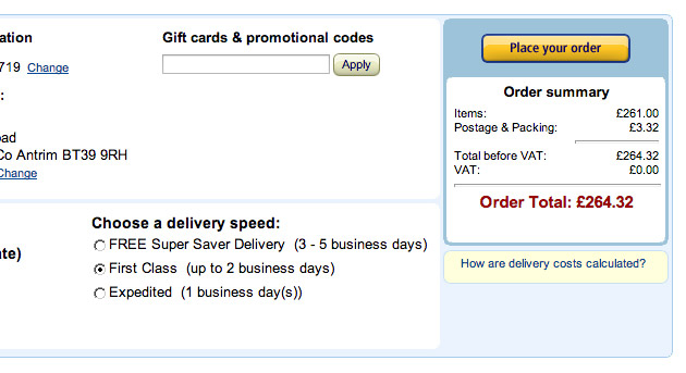
Amazon's Free Postage
Although Amazon champion their FREE Super Saver Delivery postage service, unless you actually select this option during the checkout process you will end up paying for first class delivery which is selected by default.
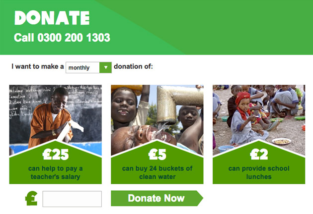
Oxfam Donations
When making a donation on the Oxfam website, there are two dark patterns in use here – the first one is the default option is set to ‘I want to make a monthly donation’ as opposed to a one off donation; many users won’t expect this and will unknowingly be committing to a monthly direct debit, which may be difficult to discover down the line.
The second pattern is using suggestion to influence the user’s decision when choosing a donation amount. A 2007 study conducted by Alexander Felfernig revealed that users are mostly like to choose the first item that appears in a list of choices; this is called the order effect. This same test was applied with search engine results:
Professor Thorsten Joachims and colleagues at Cornell University conducted a study of search engines. Among other things, their study examined the links users followed on the SERP (search engine results page). They found that 42% of users clicked the top search hit, and 8% of users clicked the second hit. So far, no news. Many previous studies, including my own, have shown that the top few entries in search listings get the preponderance of clicks and that the number one hit gets vastly more clicks than anything else. What is interesting is the researchers second test, wherein they secretly fed the search results through a script before displaying them to users. This script swapped the order of the top two search hits. In other words, what was originally the number two entry in the search engine’s prioritization ended up on top, and the top entry was relegated to second place.
In this swapped condition, users still clicked on the top entry 34% of the time and on the second hit 12% of the time.
Jacob Nielsen (The Power of Defaults: http://www.nngroup.com/articles/the-power-of-defaults/)
Users can enter their own amount in the box below but social validation is also at work here – the £25, £5 and £2 amounts suggest common donation amounts that other people might make. This example is an interesting one in terms of ethics, although it’s for a good cause and the monthly donation may indeed be the most frequent option; users are clearly being led down a path of recurring payments that they may be unaware of.
8. Masquerading
This pattern can usually be found in the form of adverts disguised as buttons or other interface elements.
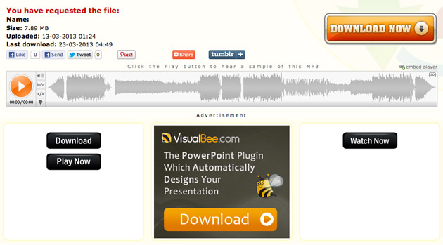
On Zippyshare, a site for sending files – it’s difficult to determine exactly which button will download the file. There are three download buttons on this page, one legitimate one and two ads masquerading as download buttons; which both trigger downloads of unrelated software products. This technique is a notorious culprit for tricking users into installing malicious software, such as spyware or viruses.
Conclusion
While there is no law against using any of these techniques, it is highly unethical to do so, not to mention the damage it will cause a brand. It’s easy to neglect the user experience when a customer is leaving a service; but the repercussions can still be severe – those now frustrated or infuriated customers are unlikely to provide good recommendations, or worse – they will engage in criticism.
If you’re a designer, it’s your duty to maintain a professional code of practice; engaging in these design patterns is not only unprofessional it may also severely damage your reputation.
In some cases, the use of dark patterns may simply be due to a lack of understanding – http://darkpatterns.org are doing a fantastic job of raising awareness of these patterns; there are even examples of brands that have backtracked after being caught out using some of these techniques.
References
Harry Bignull – Black Hat Copywriting
Harry Brignull - Dark Patterns: Dirty Tricks Designers Use to Make People do Stuff
Harry Brignull - Dark Patterns: Deception Vs. Honesty in UI Design