Pixel Perfection is Madness
The web is currently undergoing a major shift in user interaction patterns, these changes demand new techniques and approaches to designing for the medium. With more browsers and devices on the market than ever before, this has enabled us to consume information in a variety of new contexts.
Mobile devices allow content to be consumed while on the go but have also introduced numerous challenges with regards to designing for smaller screen sizes and optimising for poor bandwidth.
Content shifting applications like Pocket and Instapaper completely liberate content from its original context, allowing it to be presented on another device, in an entirely new context. We’re also witnessing a huge increase in user driven content. With so many variables, designing for the web has never been so complex and unpredictable.
These changes require that we rethink our design process. We can no longer view the web as a fixed medium constructed in pixel perfect accuracy, instead we must create designs that can respond to any given context and anticipate as many variables as possible. This means letting go of the pixel perfect accuracy we have been accustomed in the past, a trait which is still prevalent amongst many designers.
The Web Was Always Responsive
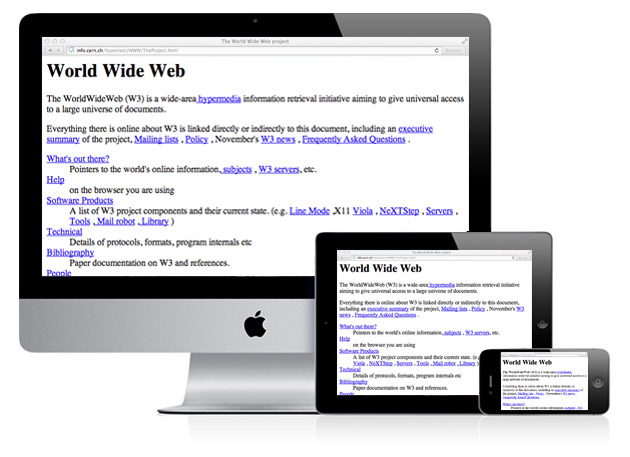
Let’s take a brief history lesson and rewind to 1991 to look at the worlds first webpage. What we find is something reflective of the responsive websites we are designing today.
This webpage was the creation of Sir Tim Berne’s-Lee, the father of the world wide web. Lee’s vision for the web was interoperability; the ability for a diverse range of systems to operate in unison. His webpage realises this vision, it’s a completely responsive, device independent design, without a fixed pixel measurement in sight.
So if the web was always responsive, when did we get sidetracked?
Graphic Designers HiJack The Web - The Madness of Fixed Page Sizes
Although these early web pages were ‘designed’ in terms of semantics, it wasn’t until the release of subsequent HTML versions that the web started to become a design centered medium – with the expansion of the HTML language, designers gained the power to create more complex layouts and designs – especially with the introduction of tables in HTML3.
Web Design at this time was certainly not the informed discipline that it is today. The first wave of designers where mostly graphic designers transitioning into a new medium, and with them they brought their own tools and processes. This resulted in effectively replicating the printed page within the browser, affording them the pixel perfect control available in the print medium.
The control which designers know in the print medium, and often desire in the web medium, is simply a function of the limitation of the printed page. We should embrace the fact that the web doesn’t have the same constraints, and design for this flexibility.
John Allsopp
It’s understandable these designers did this, they were only working with what they already knew. There were no best practices, formal education or the resources that we have available today to properly inform and educate people on how to design for the web, because no-one really knew.
These fixed width pages weren’t so much of a problem during this era as most users were viewing the web within a similar context – sitting at their desk using using similar screen sizes, hence the 800x600px and 960px design trends.
This thinking is obviously flawed today and we have made huge steps forward in the right direction with responsive design, but we still need to let go of the idea of having pixel perfect control within such an unpredictable medium.
Designing For the Responsive Web
Moving from pixel based measurements to relative measures to create layouts that scale fluidly is a step in the right direction, but it is only the beginning. There are still many issues with responsive design that need to be resolved. For instance, using a container as a means to constrain a layout is still very much a prevalent trend based on the concept of applying the printed page to the web. Replicating a Photoshop mockup in CSS and adding some media queries so it scales down from a fixed width for mobile devices does not encompass responsive design.
This approach treats responsive design as a bolt on to a fixed width design – response design should be ingrained in the design process from the onset. This technique is also bias towards mobile users, what about users on larger screens?
The space within the browser should be treated as an infinite canvas - arguably, it doesn’t make sense to create layouts that would scale to 10,000 pixels wide at this point in time, but constraining a design with a max width of 960 pixels is not an appropriate design decision in 2013. The latest iMac monitors are 2560 pixels wide – we need to consider these users just as much as we do mobile users. In the near future, we will see larger and larger devices becoming available. Some day we may be viewing webpages on a 12×8′ screen that covers the entirity of the wall in our living room.
Letting Go of Pixel Perfection
The other main issue is the idea that we can maintain the level of control that we could with fixed layouts. Attempting to position elements with pixel accuracy in a range of context is ultimately a waste of time. This is not to suggest that we no longer focus on attention to detail, but rather that we adapt a new approach in designing for unpredictability and in some cases considering function over form. It is much more important to ensure that a design is usable across as many contexts as possible than to be solely focused on aesthetic accuracy.
Aesthetics are important, but design is a much deeper process than simply applying a layer of visual eye candy and responsive design is now forcing us to think much deeper about the fundamentals of design. We are now shifting towards a focus on layout driven, content centered designs, which is where it all began in 1991.
Content Focused Design - Predictability Vs Unpredictability
Content on the early web was generally hard coded within the HTML, this predictable content afforded designers total control over the appearance of content within a pixel based layout. Copy could be tweaked to ensure the visual aesthetics were maintained.
With the introduction of content management systems – things began to change. Designers had to anticipate a degree of unpredictability when a content manager added or changed content, so layouts had to exhibit a degree of flexibility in order to compensate for this.
However, there was still a degree of predicability, the designer most likely had a firm idea of the nature of the content and could design around a limited number of variables, the modern web is unfortunately not that simple. We have shifted into a world of user driven content through the use of blogs, social media and web applications. Sites like Facebook or Pinterest are entirely user driven, the designers of these sites can’t make assumptions.
Designs therefore must not only anticipate viewing contexts, but also the fluidity of content and be flexible enough to handle every possible outcome, ensuring the content is malleable.
The Problem with Photoshop
Photoshop is a fantastic tool for web design, but it can often be misused which leads to numerous problems, the least of which is wasting vast amounts of time. Creating pixel perfect mockups in Photoshop and trying to replicate them in CSS is nothing short of total madness. Yet, this is still very much a significant part of many designers’ process.
Arguably, this approach was never efficient, but more so now than ever. Photoshop has never been able to produce an accurate representation of how a webpage will look. For a while, it came close but there are numerous issues such as font rendering – which is more apparent now with the retina devices, a font on an iPhone 4 will bear no resemblance to a font in a Photoshop composition displayed at 72dpi.
That is a minor issue however, with responsive layouts, Photoshop is very much the wrong tool for the job. The only way to properly develop a responsive layout is to do it within the actual context of use. A desktop browser is a great place to start but ideally designs should be tested out on a range of devices – viewing type in a desktop browser is very different to viewing it on a mobile device.
I’m not suggesting that Photoshop should be ditched altogether, it makes a great digital sketchbook for trying out ideas, especially while developing in the browser. Taking screenshots and cutting them up and moving things around in Photoshop is a very fast way to prototype. It is also great for setting the visual tone of the project – determining texture, colour and pattern, but any detailed typographic or layout work should be done within the browser, it may help to support this with pen and paper sketches to quickly try out layout ideas.
Style Tiles are a recent response from the web community to creating mockups for responsive design and encourage using Photoshop as a moodboarding tool to define the style of the project. These are not web page layouts.
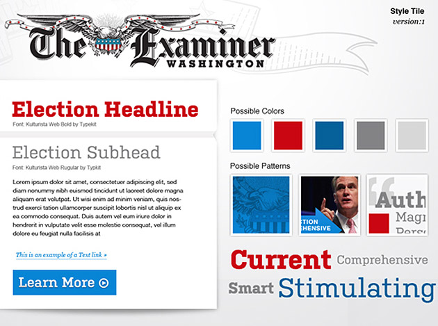
Source: alistapart.com
This process will save vast amounts of time, many tasks can be achieved much quicker with CSS than in Photoshop. Ultimately, it is a tool designed for creating and editing pictures and a picture of a website is no substitute for a fully functioning prototype that allows real world testing of device independence, navigation and interactivity in a variety of contexts.
Photoshop will be an important tool in the web designers arsenal for many years to come but the way in which we use it should change. Reliance on detailed, fixed designs should now be a thing of the past.
Closing Thoughts
Monumental steps forward have been made with responsive design but there are still many problems that need to be solved and it’s easy for our thinking to remain anchored in the past. With the rate at which our industry and technology progresses, the issue of handling unpredictability is only going to become more significant. It’s vital to start putting the foundations in place and revising our approach to how we design for the medium in order to anticipate these future problems.